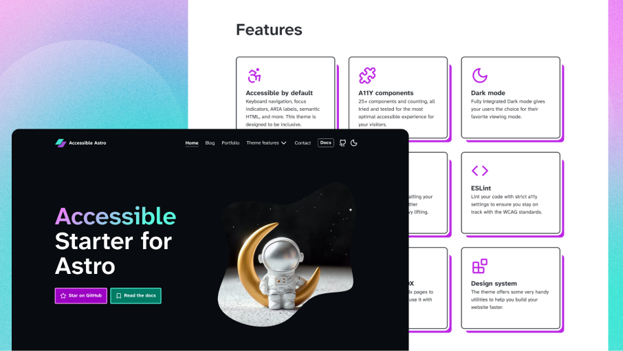
A ready-to-use, SEO and accessibility-focused Astro starter template. Built with modern web standards and WCAG guidelines in mind, it provides a solid foundation for creating inclusive websites. Features Tailwind CSS 4 integration, comprehensive component library, color contrast checker, and typography with Atkinson Hyperlegible font for improved readability. Includes dynamic blog/portfolio pages with social sharing, and full MDX support.
(Accessibility) Features
- Astro 5.13.0+
- Tailwind CSS 4.1+ support
- TypeScript integration with path aliases for easier imports and content collections support
- Prettier integration with prettier-plugin-astro and prettier-plugin-tailwind
- ESLint integration with strict accessibility settings for eslint-plugin-jsx-a11y
- Markdown and MDX support with comprehensive examples and components
- Modern OKLCH color system with automatic palette generation from primary/secondary colors
- Atkinson Hyperlegible font for improved readability and accessibility
- Lucide icon set via astro-icon for consistent, friendly icons
- Semantic HTML structure with Button, Link and Heading components
- Excellent Lighthouse/PageSpeed scores
- Accessible landmarks such as header, main, footer, section and nav
- Outline focus indicator which works on dark and light backgrounds
- Several aria attributes which provide a better experience for screen reader users
- [...page].astro and [post].astro demonstrate the use of dynamic routes and provide a basic blog with breadcrumbs and pagination
- 404.astro provides a custom 404 error page which you can adjust to your needs
- Header.astro component with optimized accessibility and design
- Footer.astro component with informative content and links
- SkipLinks.astro component to skip to either the main menu or the main content
- Navigation.astro component with keyboard accessible (dropdown) navigation and highlighted menu item option
- ResponsiveToggle.astro component with accessible responsive toggle functionality
- DarkMode.astro component toggle with accessible button and a user system preferred color scheme setting
- SiteMeta.astro SEO component for setting custom meta data on different pages
- .sr-only utility class for screen reader only text content (hides text visually)
- prefers-reduced-motion disables animations for users that have this preference turned on
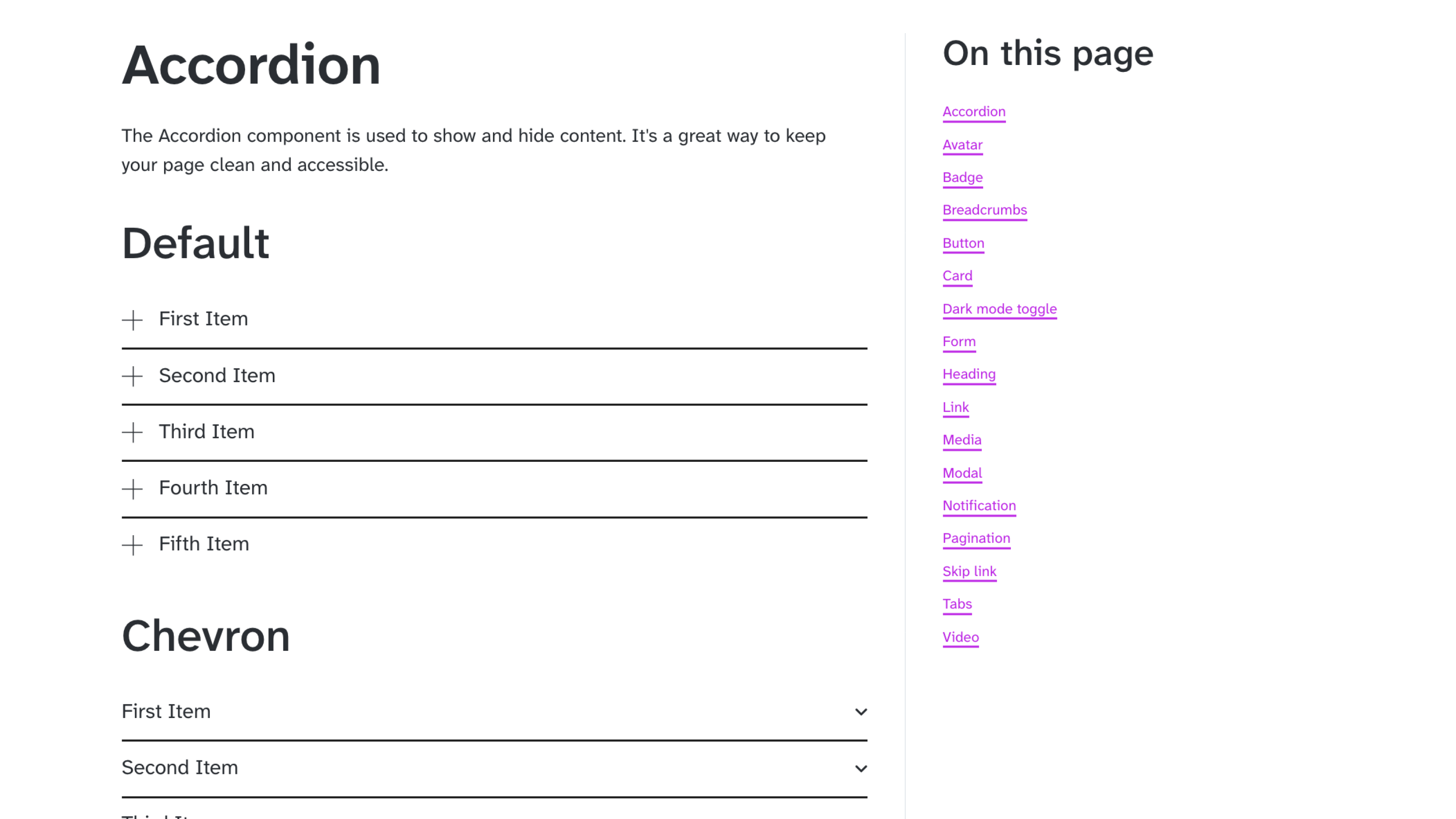
- Components including ColorContrast.astro, BlockQuote.astro, BreakoutImage.astro, Logo.astro, SocialShares.astro, PageHeader.astro, FeaturedPosts.astro, and FeaturedProjects.astro
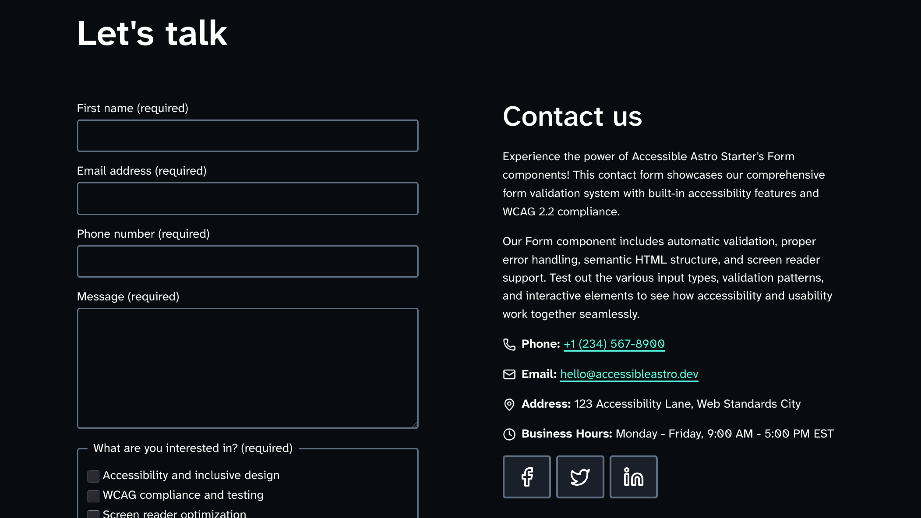
- Enhanced form components with comprehensive validation: Form, Input, Textarea, Checkbox, Radio, and Fieldset with WCAG 2.2 compliance
- Automatic form validation with custom patterns, error handling, and screen reader support
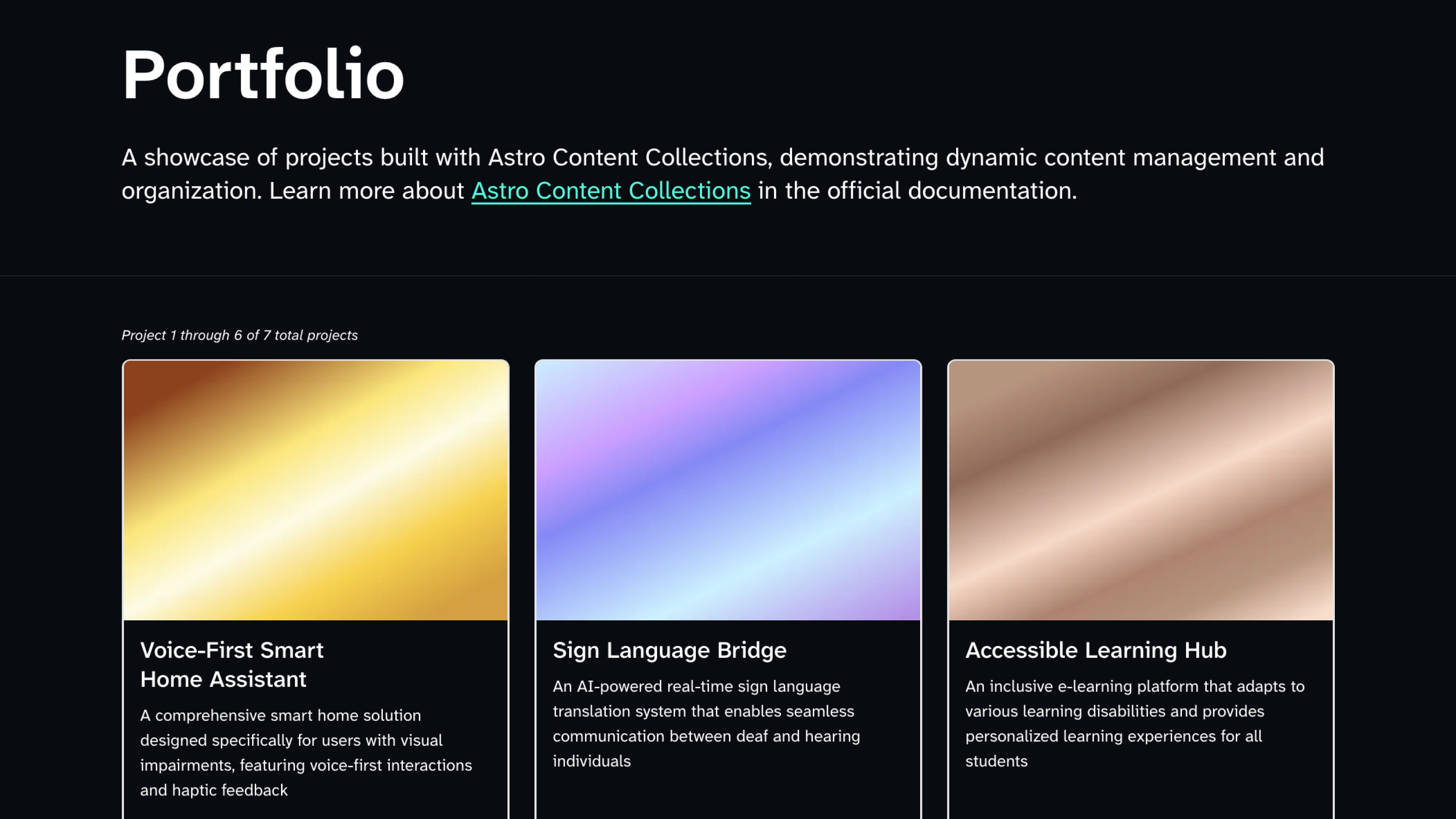
- Blog and portfolio pages with featured images, author details, social sharing, and breakout images
- Contact page with comprehensive form validation showcase and accessibility demonstrations
- Thank-you page for form submissions with interactive feedback
- Accessibility Statement template page
- Color Contrast Checker interactive page
- Comprehensive sitemap page with organized navigation and automatic XML sitemap generation via @astrojs/sitemap
- Enhanced accessible-components showcase page with expanded component demonstrations
- Smooth micro-interactions and animations on hover, open and close states (respecting reduced motion preferences)
- Comprehensive SCSS utility classes
- CSS with logical properties and custom properties
- Accessible button and hyperlink styling with clear focus states
- Styled <kbd></kbd> element for keyboard shortcut documentation
Getting started
- Clone the repository or use as a template
- npm install Installs dependencies
- npm run dev Starts local dev server at localhost:4321
- npm run build Build your production site to ./dist/
- npm run preview Preview your build locally, before deploying
Read the documentation to learn more 🚀